QuickClick
QuickClick is an additional Addition (in Latin: addere) is one of four basic operations in arithmetic. In primary school and in common language it is the expression used for the adding of two or more numbers. functionality for furniture catalogues that can evaluate an information in the CARAT data that is captured by your suppliers and is therefore free of charge for you. The CARAT QuickClick function allows you to find a graphical product quickly and select it for the design, without considering the printed sales manual and without knowledge of the part number.
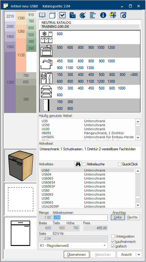
For catalogues that are equipped with QuickClick, there is a two step graphical area available in the article input dialogue Dialogue, dialogue windows or dialogue fields are special windows in software applications. Dialogue windows are displayed by application programs in different situations to request input or confirmation from the user.. This area allows you, with only two mouse clicks Typically the LEFT mouse button is pressed once quickly, if not specified differently. Clicking will either mark an object, or when clicking on a button, the execution of the desired activity (e.g. OK, Cancel, Close)., to narrow down the normal article list so much that you usually directly can select the required article from the filtered article list. For this, first select the type of article and the height (for example base unit, height 720 mm) via a schematic height grid. Then select the article function as well as the desired width of the article (for example storage, width 500 mm).
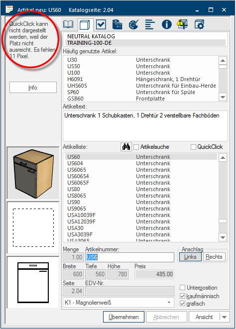
To be able to display the additional functions of QuickClick, the article input dialogue has to be expanded to at least 665 pixel Pixel or picture element identifies both, the smallest unit of digital raster graphics and the display of these graphics on a monitor with raster activation. in height. The QuickClick controls can no longer be displayed when the dialogue is smaller than 665 pixel. You will see a relevant notice to clarify this.
The article input dialogue will be displayed in maximum height, to enable you to operate the special display functions QuickClick, if you select a catalogue that is provided with additional article information for the QuickClick function by the manufacturer.
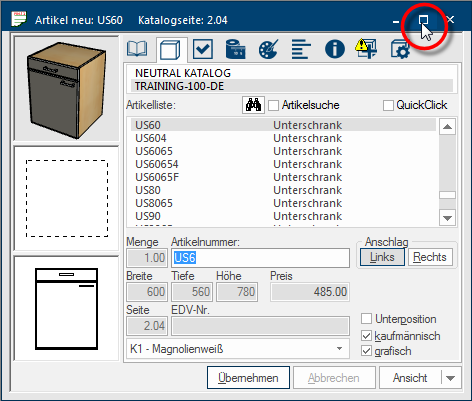
- Click on the central Maximize/Minimize button In dialogue windows you always find one or more buttons that can be activated by clicking on them. Typical functions for buttons are e.g. OK, Cancel, Apply. Buttons are always activated by a single click with the left mouse button., at the top right in the tool bar of the article input dialogue, if you want to enlarge the article input dialogue quickly to it's full height. In the process, the already opened windows will be newly arranged automatically. Re-clicking on the Maximize/Minimize button reduces the article input dialogue in size and all windows will be re-arranged as before.
- An alternative possibility is window arrangement D. In this arrangement, the article input dialogue is automatically shown on the right in its full height and the floor plan, parts list and perspective windows are arranged on the left.
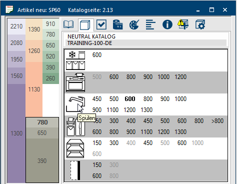
The operation of the additional function QuickClick is always done via the index Article of the article input dialogue. In order for the operating controls of QuickClick to be displayed, the article input dialogue of catalogues that are equipped with QuickClick can be automatically enlarged to the maximum displayable height. The operating controls of QuickClick are then shown in the upper third of the article input dialogue.
- In the upper left range a schematic height grid is displayed, via which you can select the main article groups with their supplier based planning heights.
- In the table right thereof you can subsequently select the width dimension from the range of the desired article function.
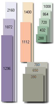
The Height grid is a schematic kitchen, where each colour group represents an article range. Furthermore can each colour group be divided in multiple, in height differing colour bars, in which one supplier dependent height dimension is displayed in each of the colour bars. The respective height measurements always is a maximum cabinet size.
|
There is also a range with a white background in the height grid of QuickClick. This range can be used to deactivate an already with QuickClick made selection, simply by clicking on the white area. |
Besides the individual article functions, the most important article width available in the catalogue are offered in the right area. After having pre-selected the article type and the article height via the height grid, only the selectable width dimensions are offered. Not selectable width dimensions are shown in light grey for a better overview.
Only a restricted amount of space is available for the specification of the width dimensions. If it so happens that more width dimensions than displayable space are available for an article function, the dimensions are summarised. Such a dimensions range is recognisable by the preceding symbol >. The dimension area >900 includes for example all articles with a width of 900 mm and wider.
Partially there can be also two rows of width dimensions, depending upon the article function. The upper row of dimensions always serves for the selection of articles in straight version. The lower row of dimensions always serves for the selection of articles that, depending on the article function, can be planned in as corner solutions, corner filler panels or as end elements.
|
Symbol: |
Name: |
Description: |
|---|---|---|
|
|
Cooling/Freezing |
By selecting a width dimension from this range, the article list is filtered in such a way that only housing units or front elements for refrigerators and/or freezers are displayed. |
|
|
Cooking/Baking |
By selecting a width dimension from this range, the article list is filtered in such a way that only housing units for build in cookers, ovens, hubs or also hoods are displayed. |
|
|
Sinks |
By selecting a width dimension from this range, the article list is filtered in such a way that besides sink base units also housing units or front elements for dishwashers or for waste separation are displayed. |
|
|
Storage |
By selecting a width dimension from this range, the article list is filtered in such a way that only articles with shelves, pullouts or special build inn's for storage are displayed. |
|
|
Shelves |
By selecting a width dimension from this range, the article list is filtered in such a way that only strait shelves or also corner and end shelves are displayed. |
|
|
Panels/Side walls/ |
By selecting a width dimension from this range, the article list is filtered in such a way that only relevant filler panels, side walls, pilasters or also corner filler panels are displayed. |
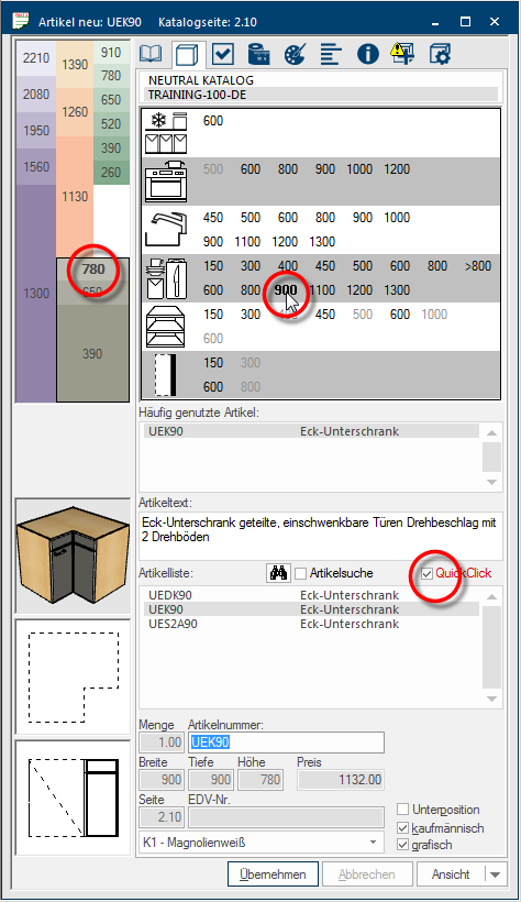
The name QuickClick will be displayed in red and the relevant checkbox A checkbox is a standard element in a graphic user interface. A checkbox has, in most cases, two states (set or not set). These usually correspond to a yes/no selection. is activated, as soon as you have made a selection in the QuickClick range. Therefore you can recognise that the article list in the article input dialogue has been filtered based on the selection thru QuickClick.
- In the following picture is for example filtered on base units height 780 mm for storage, in the second row on width (corner solution) 900 mm. To deactivate the filter it is enough to click again in the checkbox besides the name QuickClick, so as to delete the check mark.
