Installation symbols
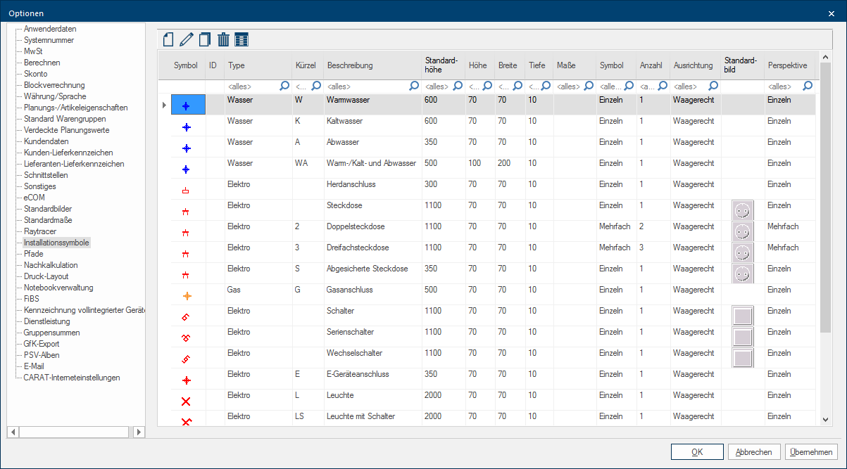
You have the possibility to modify the available standard installation symbols or create additional Addition (in Latin: addere) is one of four basic operations in arithmetic. In primary school and in common language it is the expression used for the adding of two or more numbers. entries with the existing symbols by using the page Installation symbols. The installation symbols are then available for the creation of installation plans. Among other you can change the standard plan height, the token and the colour of the symbol for the installation plan, the name of the legend as well as the graphic for the perspective. See also: The Installation Plan
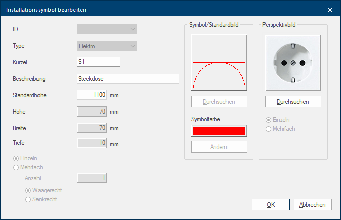
You can create a new entry, edit an existing entry, copy or delete own created entries by using the icon bar. A dialog will open if you use the functions New, Edit and Copy, via this dialogue Dialogue, dialogue windows or dialogue fields are special windows in software applications. Dialogue windows are displayed by application programs in different situations to request input or confirmation from the user. you can adapt the installation symbols to your needs.
|
Name: |
Description: |
|---|---|
|
Symbol |
The default picture which is assigned to the respective installation symbol is displayed in the column Symbol. This default picture is used in the installation plan (wall/floor/ceiling). |
|
ID |
You can select a number for new created or copied installation symbols from the list box If several options are provides for one function provides, are these often shown in a list. Please click on the little black triangle in the right margin to select the desired option. ID. It concerns a definite number from 1 till 50. This ID is needed to identify the self created installation symbols independently from the selected token or description. The self created installation symbols can also be distributed per subsidiary administration by using the ID. Also the order in which the installation symbols are displayed in the selection dialogue for the creation of installation plans is based on the ID. |
|
Type |
The group name to which the installation symbol is assigned is entered in the field Type. This assignment is necessary to decide via the view options The word option (from Latin: optio = free will) used in computing means a choice. In CARAT it is normally used with a list box. or the print layout which installation symbols should be displayed or printed. |
|
Token |
You can enter a short name for the respective installation symbol via the field Token. This token is displayed at the respective symbol in the view and also serves as reference to the description in the legend. The token can also be modified for the standard installation symbols, for example to be able to achieve an adjustment in the letter sequence of the token, fitting the language in use. |
|
Description |
More detailed info about the respective installation symbol can be entered in the field Description. That description is also in use for the quick help (tool tip) as well as for the legend. The description can also be modified for the standard installation symbols, for example to be able to achieve an adjustment to the language in use. |
|
Standard height |
The height on which the respective installation symbol automatically will be planned in, as far as no other modification occur, can be entered in the field Standard height. The standard height can also be modified for the standard installation symbols. |
|
Height, Width, Depth |
You can enter the measurements of the individual installation symbols via the fields Height, Width, Depth. |
|
Quantity |
If the option has been selected multiple times you can state how oft the respective installation symbol should be drawn via the field Quantity. For a triple power socket should a 3 be stated as quantity. |
|
Orientation |
Via the radio buttons A radio button is a standard element of graphic user interfaces. In contrast to a checkbox, when used in a group, only one radio button may be marked at a time. The name radio button comes from its similar behaviour to selecting a radio station on an old fashioned radio: when one button is pushed the others pop back out. Horizontal/Vertical you can state how a multiple repeated installation symbol, a triple power socket for example, should be displayed. |
|
Symbol/Default picture |
You can select the desired 2D-design from the available symbols by clicking Typically the LEFT mouse button is pressed once quickly, if not specified differently. Clicking will either mark an object, or when clicking on a button, the execution of the desired activity (e.g. OK, Cancel, Close). the button In dialogue windows you always find one or more buttons that can be activated by clicking on them. Typical functions for buttons are e.g. OK, Cancel, Apply. Buttons are always activated by a single click with the left mouse button. Browse. |
|
Symbol colour |
A colour for the 2D-symbol can be selected via the button Edit. |
|
Perspective picture |
You can select a texture In computer graphics, one uses textures as surfaces of a 3D models. form the overview, that will serve for the representation of the installation symbol in the perspective by clicking the button Browse. Also for the perspective you can state if the texture should be repeated multiple times. |
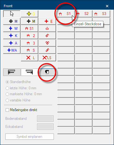
The self created variants are available in the area user defined installation symbols as soon as you subsequently access the installation plan. For better distinction will the token be displayed besides the symbol in the selection dialogue, as you can recognise from the illustration. Furthermore, you can recognise the quick help (tool tip) which appears automatically as soon as the mouse pointer pauses shortly on one of the buttons.
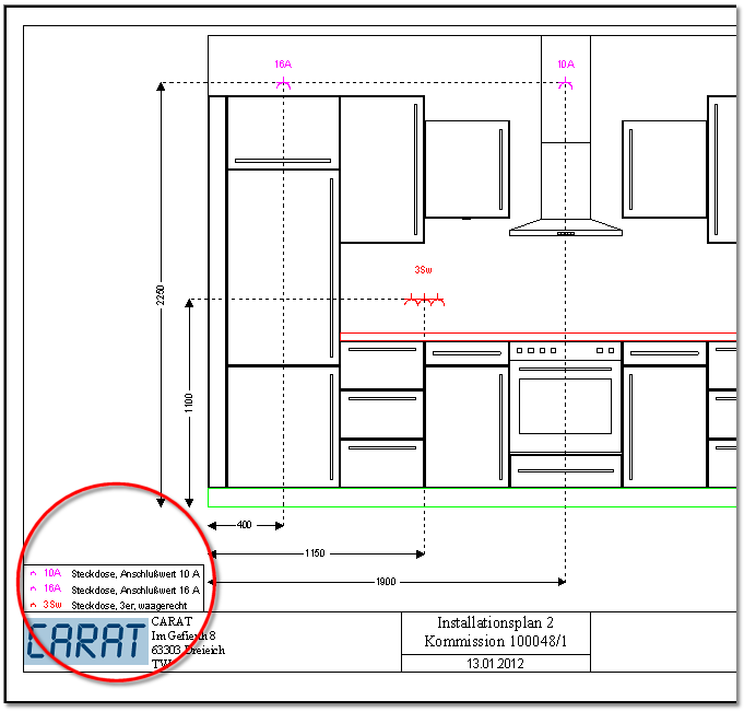
If you print an installation plan, you can additionally print the legend, so that then besides the token of the respective installation symbol also the more detailed description is displayed. Thus can the individual installation symbols be better classified, especially when you abstain from the reproduction of the furniture, for example for a better readability.


